When songwriter & producer Brian Wilson played the rest of the Beach Boys the songs that would become the Pet Sounds album, they were distinctly underwhelmed. Brian plugged away at the piano presenting the sketches for each song that would become their classic album – but the Boys were not impressed. They thought he’d flipped (which indeed he did, but not until a whole while later). Right now he was at the top of his game, so what was the problem? As he played, Brian (and only Brian) could hear what wasn’t there: where the percussion would sit, how the bass would give depth and where the harmonies would rise and fall. The Boys were struggling to find the nuance within these bare bones performances. Even a genius can have troubling selling a great idea.
Successfully selling your concept to someone else requires an understanding of five things: the concept must be good enough to pique their interest, you must understand your audience, and then use the appropriate presentation methods for that audience. You then need the luck of timing, which means the concept must catch the client’s attention at a point where they’re predisposed to want to act upon it. Finally, you’re asking for a leap of faith so the strength of the relationship you have (or are forming) with the client will help garner trust and your ability to deliver.

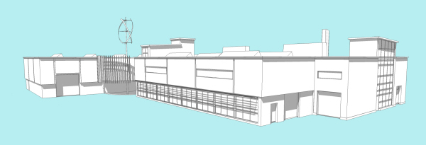
Assuming you’ve done your research and come up with a sound response to a given problem, your next problem is representation. Nowadays we have a myriad of techniques at our disposal, from pencil sketches or CAD, physical models to 3D walkthroughs, watercolours to photomontages. Just as we favour certain methods, different organisations and personalities respond to different media. You should consider the technical knowledge of the individuals and how they perceive style versus substance. One man’s flashy graphic is another man’s hogwash. Some clients enjoy the looseness of a sketch, while others trust you to go away and only come back when the messy design bit is done, printed and laminated onto boards.
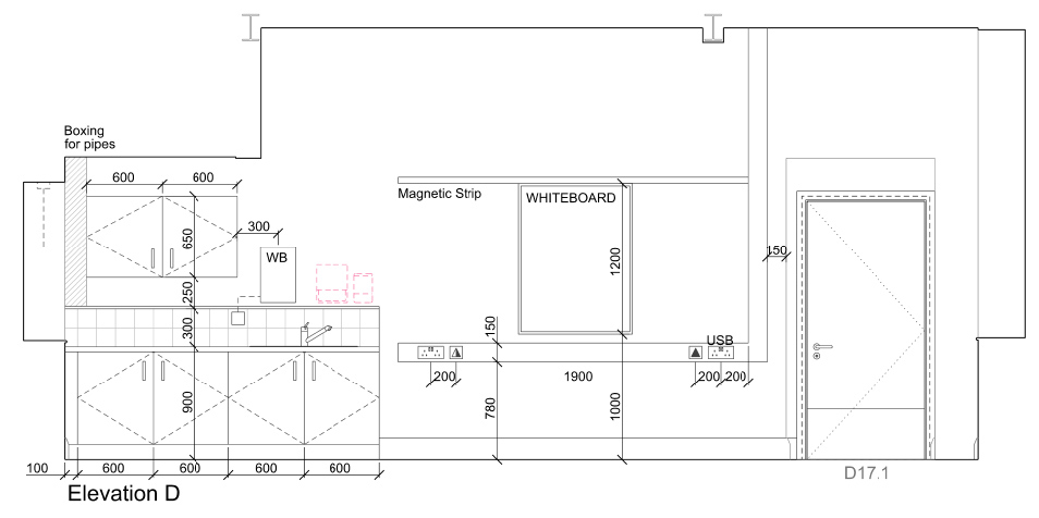
On a complex design there might be a hierarchy of concepts to be agreed. A steering group might agree the macro concept but sector managers will be delegated the micro decisions within their departments. Here we have found creating 3D visuals of every wall down to the light switches and sockets ensures little room for interpretation but plenty of time for discussion and fine tuning. By illustrating everything they can then see what’s missing or in the wrong place. A simple adjustment can make it perfect.
Often it is sensible to present visuals in muted tones or greyscale because the right scheme illustrated in the wrong colours will fail. Colour is very subjective. We once showed a small area of red wall on a large Mercedes-Benz office interior visualisation. They immediately honed in on the red and set us straight: red is Ferrari, not Mercedes-Benz. Approach colour later, once the overall form and arrangement of pieces are in the right place. As we use email more we lose control of how faithfully the recipient’s equipment will reproduce our colour images. Standardised formats like PDF produce accurate facsimiles on screen, but printers have wide variations. If the pale blue sky prints as a nuclear purple it can distort that all-important first impression.
As every problem is different every solution must be different. At architectural school you learn that you have to design both the building and the presentation: what you say, how you prioritise the key issues, where you position each image to tell a convincing story and how to finish on a stunning visual. If you get these things right, your concepts will have guaranteed Goosebumpability, and you’ll all be feeling those Good Vibrations.